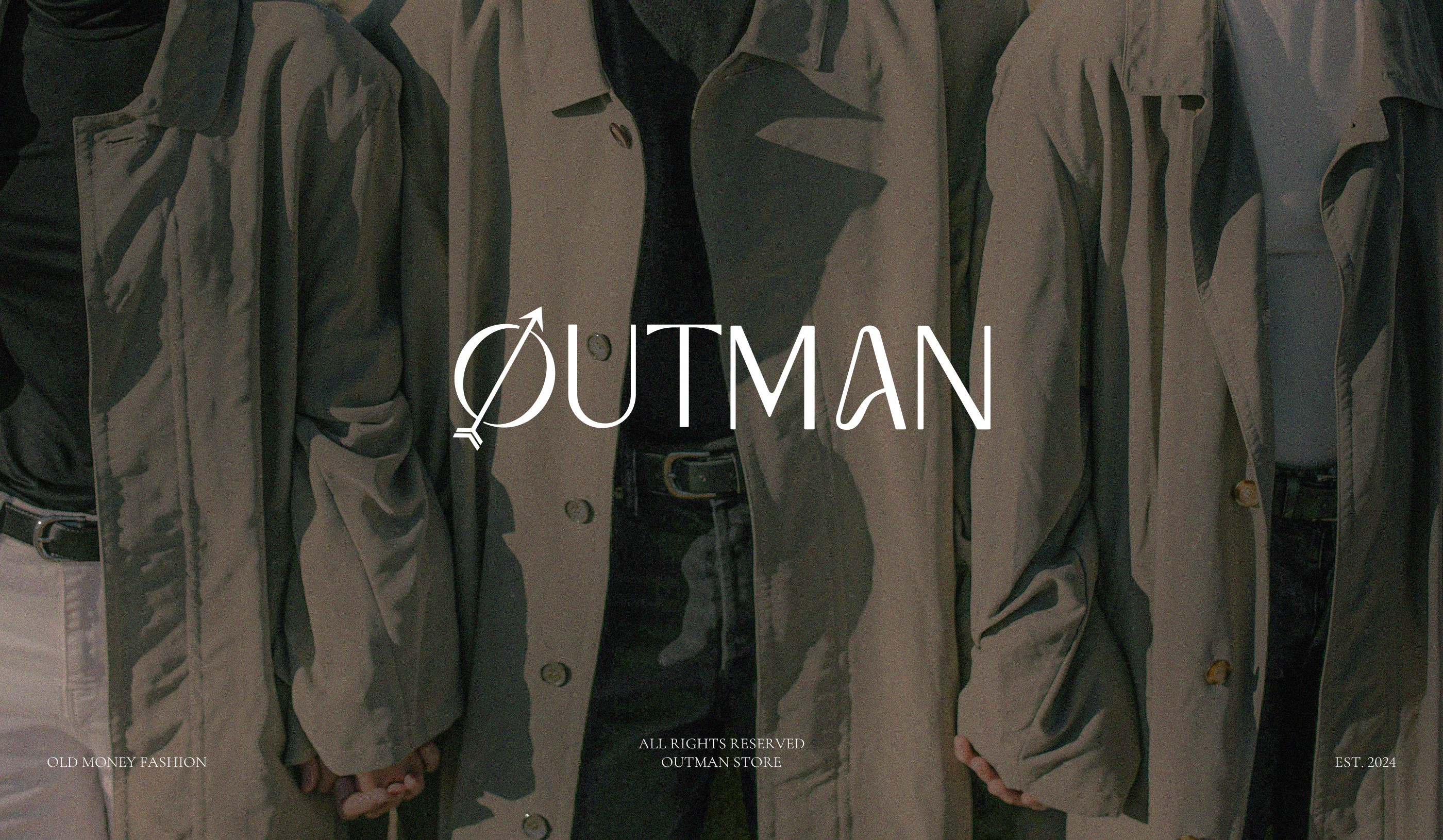
Outman
Logo, Visual Identity & Stationery Design inspired by the timeless sophistication of “old money” fashion—crafted to reflect a lifestyle of understated elegance, masculine poise, and modern legacy.
Scope
Logo Design, Visual Identity and Stationery
About
Outman is a fashion label rooted in the old money aesthetic, designed for those who dress not to impress, but to express legacy, confidence, and class. The brand offers tailored pieces that whisper wealth—not scream it—evoking an effortless blend of vintage charm and contemporary refinement. From the iconic symbol inspired by masculine energy and direction, to the classic typography and sleek stationery system, every design decision was made to reflect Outman’s philosophy: More than a look—it’s a legacy.

Crafting the brand identity for Outman was a deep dive into timeless sophistication.
Rooted in the “old money” aesthetic, the design approach centered around evoking a sense of quiet luxury and masculine elegance. The logo was developed to symbolize heritage and poise—drawing from classic forms and refined symmetry to express confidence without excess.
From the muted, legacy-inspired color palette to the sharp yet understated typography, every element was curated to reflect Outman's philosophy: that true style doesn’t shout—it endures. The visual identity and stationery design together shaped a brand language that feels effortlessly elite, mature, and intentional.
This creative collaboration captured more than fashion—it framed a lifestyle of legacy.